| Comment: |
thanks for a good, honest representational scan of this rare comic book! Much appreciated! |
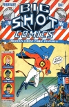
| Comment: |
To be honest, I think this looks a little overprocessed. The contrast on the paper grain makes it look like it was printed on stucco rather than newsprint. Adjusting the contrast to this degree also alters the colors, making yellows flourescent and the dot patterns on the skin tones tend to get too dark and exaggerated making it look like everyone has measles. Still, I'd give this scan a solid 9. :) |
| Comment: |
Thank you dsdaboss!
I agree with you fongool, I also like when you can still see the paper grain or
the rasterized color patern, when you have the feeling that you are reading
the actual book. Sometime the paper is to dark and a bit of re-contrast is not bad
but too much white burns the eyes when reading on computer screen.
In that matter I always remember two key sentences my drawing teacher used to say.
"Better" is always the enemies of "good"
"Effect to do good would do better if they were not there"
Nevertheless, these scans look just perfect regarding the ones with Heavy contrast
and burned, blurred or boiled colors. |